So it’s primary season in America, and while most people are concerned with “issues” and “leadership,” all I really care about is web design. That’s why I’ve decided to compare and contrast the official websites of Hillary Clinton and Barack Obama. I combed through both sites carefully and created a brief list of what works and what doesn’t for each. Okay, I mostly harped on the negative and petty, but whatever. This is a blog, not a newspaper. I’m allowed to be unreasonable.
That being said, this is meant to be as objective as possible. Political discussion is welcomed, but please do not interpret this post as an endorsement of any kind — although, I’m sure the candidates are all waiting with baited breath for an official B-Side Blog show of support. Additionally, if you base your vote on my superficial findings, you’re kind of an idiot. Just saying.
With the disclaimers out of the way, let’s move onto the sites.
First up is Obama’s site, found at, you guessed it, barackobama.com. At first glance, the site appears to be clean, streamlined, and easy-on-the-eyes (much like Elizabeth Kucinich — grrrowl!). There’s plenty of open space on the site, thus reducing clutter and improving readability. Oh Barack, you so slick!
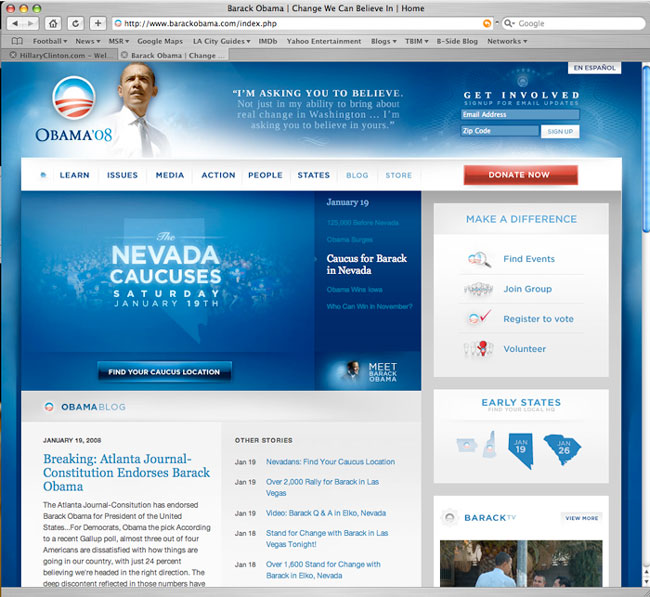
Lots of soothing blue. The gradients create a sense of relaxing modernity. It’s sort of like if an iMac desktop decided to run for president.

Overall, the use of Flash is pleasant and engaging, but there’s a bit too much spinny wheel action for my tastes. Is that what we’re going to see in a crisis? A SPINNY WHEEL?!?!?!?
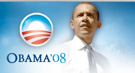
At the top of every page is this image: the standard “I’m so full of leadership that all I can do is STARE OFF IN THE DISTANCE” pose. The circular logo to the left is okay, but it kind of seems like a Greatest Hits of dinner mints. Lifesaver-Altoid-candy-cane hybrid, anyone?
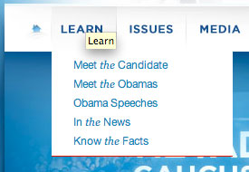
The site menus, while clear, drive me nuts with the haphazard italics. Why must every definite article be emphasized? Is there something intrinsically special about the concept of News that deserves an italicized “the”?
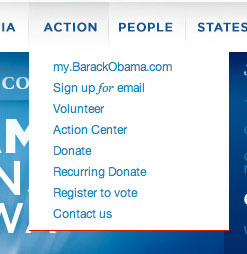
Again, the italics make a random cameo in another menu. Don’t just sign up for email. Sign up FOR email!!!
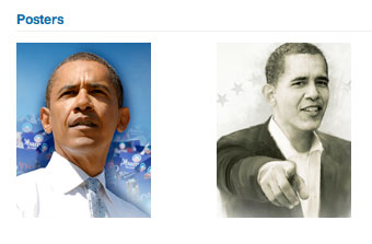
The Downloads section of the site offers up, among other things, posters of Obama. The pic on the left is merely the same generic photo of Barack looking whimsically off into the distance, perhaps having a pensive, Presidential thought — or perhaps just looking at a cloud. The pic on the right, on the other hand, is strange and awkward — the sort of pose that would surely incur the wrath of Tyra Banks and her gaggle of gays. He’d do well to get some better posters.
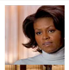
Meanwhile, in the photos and videos section, there’s only one picture of Michelle, and she looks like THIS. C’mon, Barack. Show your lady some love. Give her a more flattering pic.
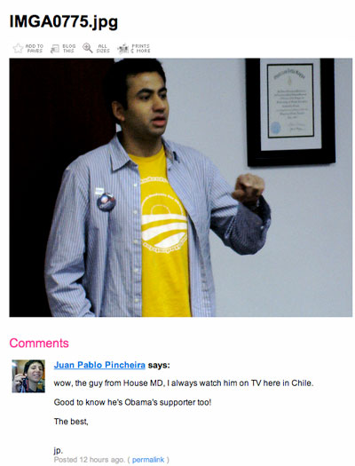
The site often urges readers to check out its Flickr photo stream, which prominently features Kal Penn, or as Juan Pablo Pincheira calls him, “the guy from House MD.” I like him as much as the next guy, but I’m starting to think that people who use Kal Penn pics to be cool might just be douchebags.

Me & Kal. BFF!!!!
Anyway, time to check out Hillary’s site at Hillaryclinton.com.
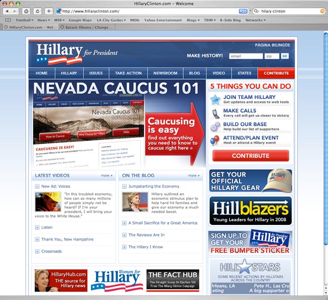
GOOD GOD. So… much… clutter…
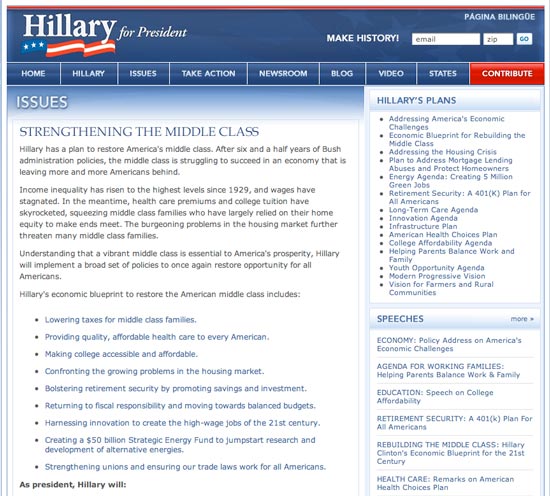
Hillary’s site is dominated by text. Lots and lots of text. And whither Hill-dawg? She’s not even in her own header. You know what’s there? TEXT.
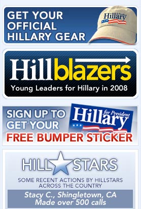
Meanwhile, these eyesores stink up Hillary’s main page. It’s not unlike the visual assault of advertising one finds on a porn site. Just sayin’.

I appreciate a good pun, but these are just forced. Okay, Hillblazers instead of trailblazers—that sort of works (even though it doesn’t rhyme AT ALL). But what about…

Hill Stars? I don’t really get it. Oh wait. It’s a riff on All-Stars. Blah. There’s also a fundraising section devoted to what’s referred to as “HillRaisers.” I assume the “Hill” replaces “Fund,” which kind of doesn’t make sense as there are no shared letters or phonetics in the two words, thus undermining the entire notion of a pun. Amusingly enough, it’s almost a perfect pun for “Hellraisers,” which is probably not exactly what the Clinton campaign had in mind — unless, of course, Hillary plans to court the elusive Pinhead vote.
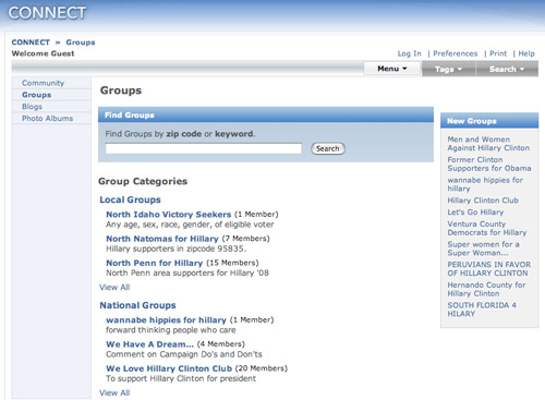
Well, this is a lovely exercise in dryness.
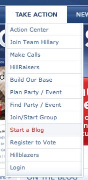
And now the coup de grâce. I click on the intriguing “Start a Blog” option…
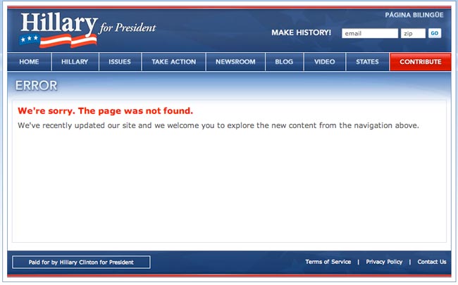
GASP! That thump you just heard was me fainting on the floor. Page not found!??!?!? I’m stunned.
Well, as you can see, both sites had plenty to quibble about, but ultimately, I have to give Obama the edge in this round. His site is easy to digest and smart in its navigational flow. Clutter is kept to a minimum, text is properly broken up, and as far as I could tell, all his pages actually worked.
What do you think? Whose is better in your opinion? And should I review more of the candidates’ sites?
Yes, you should review more of the candidates’ sites. Personally, I’d also pick Obama’s as the best out of these two because it’s well-organized in comparison to Hillary’s over-lively site.
Upper right hand corner Obama has “en español”.
Upper right hand corner Hillary has “página bilingüe”.
I actually have a página bilingüe.
hb
I thought a HillBlazer was a jacket.
Please, please do the other canditate’s sites. I want to see that wackado, Ron Paul’s site. 🙂
My vote is for Obama’s site. Please do the other candidates sites!
I agree that Obama site is better but that picture of him is not good. The angle is bad for him on so many levels. I don’t think he looks like he’s pensive and having a presidental thought, more like he’s squinting into the distance and wonder “do I know that person?”.
I also think Obama’s site is way better. I was disappointed the HillBlazer’s weren’t sportscoats. I pictured everyone working on campaign looking like Century 21 agents in pretty gold jackets. Please do other candidate’s sites!
Obama’s site looks like a Pepsi ad. Surprised he’s not promoting himself as “the choice of a new generation.”
You left out Kucinich. I am filing a complaint with the FCC and adding your name to the CNN debate complaint!!
That dude really does get the shaft… But I do suggest you check out his site, if only for the self-polling data that he uses to prop up his candidacy.
Some other suggestions:
And might I also suggest checking out Mr. Nine/Eleven’s website, before he completely collapses in Florida next week. Perhaps you could hold a craptastic contest with your readers to see who can find the most 9/11 references from his website.
And don’t forget to check out the Hucksters site, I heard that he has a recipe section on how to cook-up fried squirrel with a pop-corn popper. I’m not kidding…
Check out Fred T’s website. He looks REALLY tired. I wonder if his web site makes you want to take a nap too…
I could go on and on.
Two other BIG differences between the two websites:
Obama uses LOTS of video. From the home page on, he’s talking at you. At first I thought, “Ah, a great communicator!” But then, as I returned to the home page repeatedly because that’s about the only way to navigate around the site, I found myself thinking “How do I shut him up?”
Still, Hillary uses NO video. Shortsighted on her part, I think.
Next, both websites have a red “DONATE” button prominently displayed on the menu (with all other menu items in blue). Click on it, and see who you want to vote for:
Obama asks you to give $25 or more.
Hillary asks for $10 or more.
Frankly, with econonic fragility screaming from the daily headlines, I think $5 would be a good initial “ask.” Those who can give more, will.
And for the record, I haven’t made up my mind yet…
Thanks for this great post, this is very useful and interesting.
Barack Obama is the best president-*~