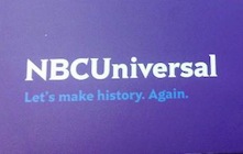
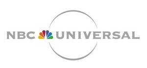
Now that NBC Universal has gone through the ringer with Comcast, we have a new logo. First things first: NBC Universal is now NBCUniversal (goodbye infernal spaces, hello corporate kerning efficiency); secondly, the NBC peacock is gone (only from NBCU logos, not NBCU); thirdly, no more Universal globe; fourthly, purple – lots of it; and fifthly, a bizarre font that looks not unlike some Nick-At-Nite remnant. I’m not sure I love the look, and the only thing keeping it from the hall of design missteps is that the original logo wasn’t as commonplace or recognized as the likes of Tropicana, Gap, or Comedy Central.
What do you think about it?
Via TVNewser


I will forever miss the peacock. And I hate the new logo!
Did they ask Kabletown to approve this new logo?
The logo’s awful – I hate the new font.
And the all cap NBCU made me think diploma mill. Where did you get your degree? I graduated summa cum laude from NBCU… it’s a small school, don’t try to find it…. can we change the subject?
Ick. That’s just awful. Looks like someone from elementary school submitted a design they made on their classroom computer.
Giant Fail!
Not only is the new logo ugly, but using it is a bad strategic move. I would think that Comcast/Kabletown would prefer to not remind people that it now controls both content and distribution.
This merger is bad news. Back in the 50’s, the movie studios used to own all the movie theaters until the Department of Justice forced the studios to divest the theaters because of the potential for unfair competition.
Things are different now. yeah, right.